Did you know that football data visuals let analysts see how players move, which areas of the pitch they control, and how the actions that end in goals are built up. Each visual gives you a different angle on the match and helps you connect the numbers with the tactical reality on the pitch.
A heat map shows positional influence, a passing network highlights the team’s structure, and a shot map reveals how effective a side is in front of goal. The real power of football visuals lies in how they turn raw stats into proper understanding of the game.
In this article, we break down the most effective visuals and the tools professional clubs use to make data-driven decisions and boost their performance.
Which football data visuals are best for analysing the game?
Football visuals have become the natural language of modern analytics because they help you understand collective dynamics, spot repeated patterns, and pick up details the human eye simply misses during a match. Each visual serves a specific purpose, from evaluating positioning to measuring the effectiveness of an action. Their real value lies in turning millions of data points into a clear picture that coaches and analysts can actually use.
Among the most popular visuals, heat maps stand out as they reveal spatial occupation and the areas with the most attacking or defensive activity. Passing networks show how players connect with each other and expose the structure of the team in every phase. Shot maps and expected goals models help quantify the true quality of chances, while radar charts make it easier to compare player profiles and get a balanced view of performance.
The rise of analysis platforms has multiplied visualisation options and changed the way the game is interpreted. Thanks to this evolution, tools like StatsBomb IQ, Wyscout and Tableau now offer interactive visuals that blend event data, tracking information and contextual metrics in the same environment. With this integration, analysts can overlay sequences, filter specific actions, and spot tactical changes between matches or competitions with far more precision. This flexibility allows modern systems to adapt to different playing styles, adjusting the scale and depth of the data depending on the player’s role or the team’s model.
The best football data visuals are the ones that tell a story without needing any extra explanation. Good design isn’t about looking flashy, it’s about making things clearer. When a visual shows exactly what’s happening on the pitch, it becomes a strategic tool that brings data, tactics and decision-making together
Most commonly used types of football data visuals
Using visuals in football changes the way performance is interpreted and tactical information is communicated, because each graphic turns part of the game into something easy to understand. This allows analysts to convert thousands of actions into clear visual knowledge. The key is choosing the type of visual that best represents the aspect of play you want to study.
Over the past few years, several visual models have become standard, covering the main dimensions of the game.
Heat maps
Heat maps are one of the most widely used visuals in performance analysis because they show spatial occupation and the intensity of a player’s or a team’s involvement. Every area of the pitch reflects how often actions happen there, turning a huge volume of data into an image that’s intuitive and easy to read.
In football, these visuals help you understand how a team behaves in different phases of play. In defence, they show whether the block stays compact or if there are gaps between the lines. In attack, they highlight where the most dangerous actions are built and the preferred routes to progress towards the opposition box.
Analysts often compare heat maps across different matches or time periods to spot role changes, tactical adjustments or structural imbalances. For example, a shift in colour density can reveal higher pressing, a change of system or an adaptation to the opponent.
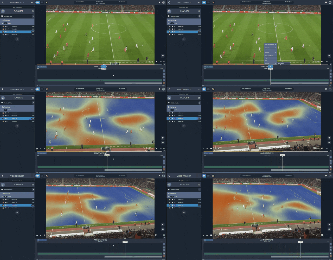
Modern tools such as StatsBomb IQ and Wyscout allow you to create dynamic heat maps by filtering by player, action or time period, turning this visual into a key resource for interpreting collective behaviours with proper tactical precision.
Passing networks
Passing networks show a team’s collective structure and reveal how possession flows between players. Each node represents a footballer, and the connecting lines show the frequency and direction of passes. The thickness of the lines indicates how many passes were made, while the position of each node usually matches the player’s average heat-map location, creating a clear picture of the team’s tactical organisation.
This type of visual helps you spot association patterns, areas with stronger connections and the key players within the system. A midfielder with many links, for instance, acts as the hub of the game, while an unbalanced network can reveal an over-reliance on one side of the pitch or on a single player.
Analysts compare passing networks between matches to see whether the team keeps a consistent structure or whether the opponent’s press disrupts its natural flow. Changes in density or symmetry also reveal strategic shifts, such as using a double pivot or building up with a back three.
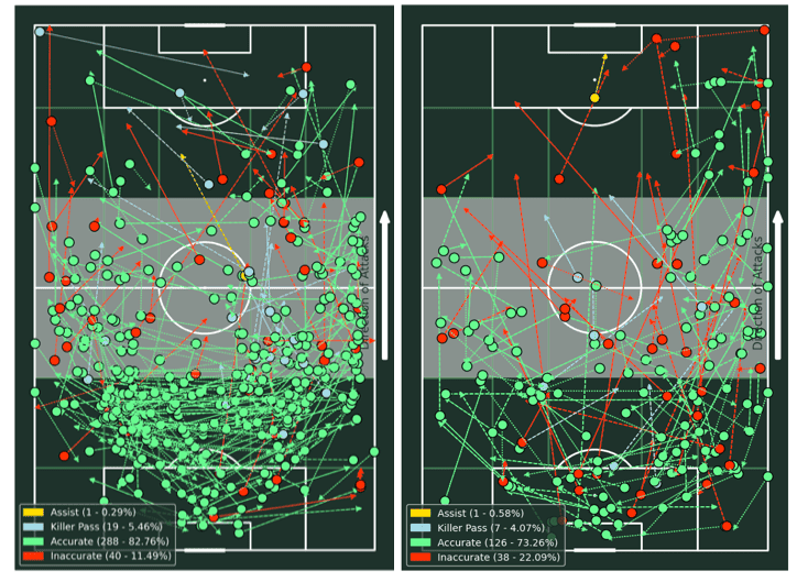
Platforms such as Tableau, Power BI or Python libraries like NetworkX and Plotly make it easy to build dynamic passing networks that can be filtered by phase of play, time or match state, turning possession into a clear map of collective decision-making.
Shot maps and xG models
Shot maps and expected goals models, known as xG, are essential tools for assessing the real attacking efficiency of a team or a player. Unlike simple shooting stats, these visuals analyse the quality and likelihood of each attempt becoming a goal, taking into account several variables such as distance to goal, shooting angle, body part used, type of assist or the number of nearby defenders.
Shot maps display all the shots taken during a match or a whole season, showing their location, outcome and the xG value attached to each one. Different colours or point sizes indicate the level of threat of every chance. This helps you tell the difference between a player who produces lots of low-quality attempts and another who creates fewer chances but with a much higher expected-goal value.
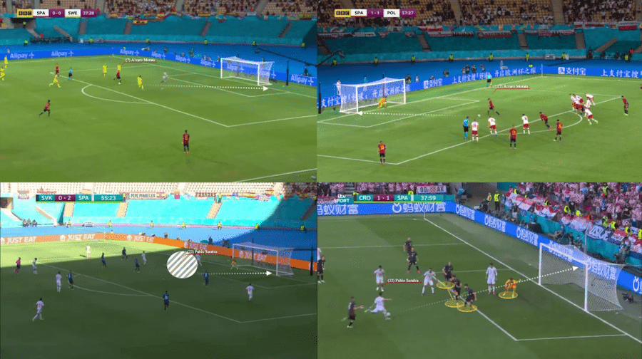
Analysts use these visuals to spot attacking patterns, assess decision-making efficiency and judge whether a player’s or a team’s goal output is actually sustainable. They’re also useful in scouting, as they show the type of chances a player tends to create or finish.
Tools such as StatsBomb IQ, Fbref and Python libraries like Matplotlib and Seaborn make it easy to build interactive, custom shot maps that turn attacking data into tactical insight you can actually apply.
Radar charts or polar charts
Radar charts, also known as polar charts, are one of the most powerful tools for comparing players or teams across multiple metrics at the same time. Each axis represents a performance variable such as progressive passes, duels won, shots or defensive actions, and the shape of the resulting polygon gives you an instant view of a player’s competitive profile.
Their main advantage is how easy it is to spot strengths and weaknesses at a glance. A balanced radar shows consistency across all areas, while an uneven one highlights specialisation or gaps in certain aspects. Analysts use this type of visual to place performance in context, comparing it with the league average or with players in the same position, which makes comparisons far fairer and more objective.
In scouting and sporting direction, radar charts are essential for identifying profiles that fit a specific playing model. For example, a midfielder with a high rate of vertical passing and effective pressing may be a perfect fit for possession-dominant systems.
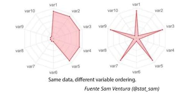
Platforms such as Twenty3 Sport, The Analyst or Python scripts using libraries like Plotly and Matplotlib allow you to customise these charts, normalise the data by percentiles and build dynamic comparisons that make strategic decision-making much simpler.
Advanced visuals
Advanced visuals offer a type of graphic that lets you analyse football from a deeper perspective, linking the data with the team’s structure and collective behaviour. Unlike descriptive visuals, they don’t just show the outcome of actions but also how those actions are created and how they develop within the context of the game.
Among the most commonly used are:
- Positional plots: These show the average position and movement of players during different phases of the match. They help you study block compactness, attacking width and defensive imbalances.
- Pressing visuals: These highlight the areas of the pitch where a team applies the most defensive intensity. They make it easier to identify zones where the ball is won back and to judge the effectiveness of the pressing.
- Multivariate scatter plots: These combine metrics such as progression, effectiveness or duels won, using colour and size to add extra layers of analysis. They’re useful for uncovering relationships between individual and collective performance.
- Interactive time sequences: These display the flow of the ball or chained actions throughout the match, allowing you to detect tempo shifts, transitions and possession patterns.
Taken together, these advanced visuals offer a dynamic reading of the game and turn data into a tactical and predictive tool.
Football visuals act as a true representation of modern analysis, showing collective patterns, tactical repetitions and details that are impossible to spot through human observation alone
Which football data visuals are recommended for showing trends and statistics effectively?
Beyond the visuals that show team structure, there are others designed to analyse how performance evolves over time. These tools let you track how metrics change throughout a match or across a season, and they help identify patterns of improvement, stability or decline within a team’s tactical model.
Among the most effective visuals for representing trends and statistics are:
- Cumulative line charts or xG timelines: These show the evolution of a team’s attacking threat and the moments of offensive dominance. They clearly display how expected goals progress throughout the match.
- Normalised per-90 bar charts: These allow you to compare players or teams under the same time conditions, revealing how consistent their performances really are.
- Advanced scatter plots: These help you identify relationships between variables, such as effective pressing and attacking progression, highlighting patterns that don’t appear in raw totals.
- Small multiples: These present the same metric across different matches and are useful for analysing tactical continuity or structural variations over time.
Taken together, these visuals offer a longitudinal reading of the game and turn data into strategic insight about how collective performance evolves.
Trend-focused graphics not only let you track how the game develops, they also help you understand how data becomes applied tactical knowledge. The key is using these visuals within a working ecosystem that brings together methodology, technology and proper analytical judgement.
There’s no single best tool, but rather a set of platforms that evolves with each team’s needs and working methods. What truly matters is mastering the logic behind each visual and knowing exactly what information you want to communicate.
Training in visualisation and advanced analysis is the natural next step. The Master’s Degree in Scouting Applied to Football teaches you how to create, interpret and apply football visuals using real data, preparing the analysts who are reshaping how the game is understood today.
Fill in the form below to receive more information about the Master’s Degree in Scouting Applied to Football
Spanish version https://sportsdatacampus.com/cuales-son-los-mejores-graficos-de-futbol/

